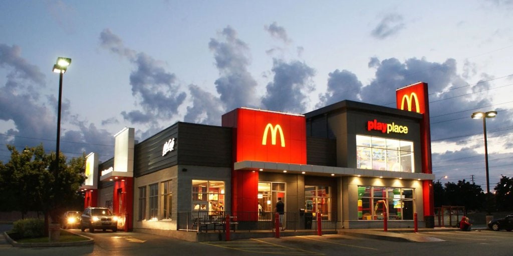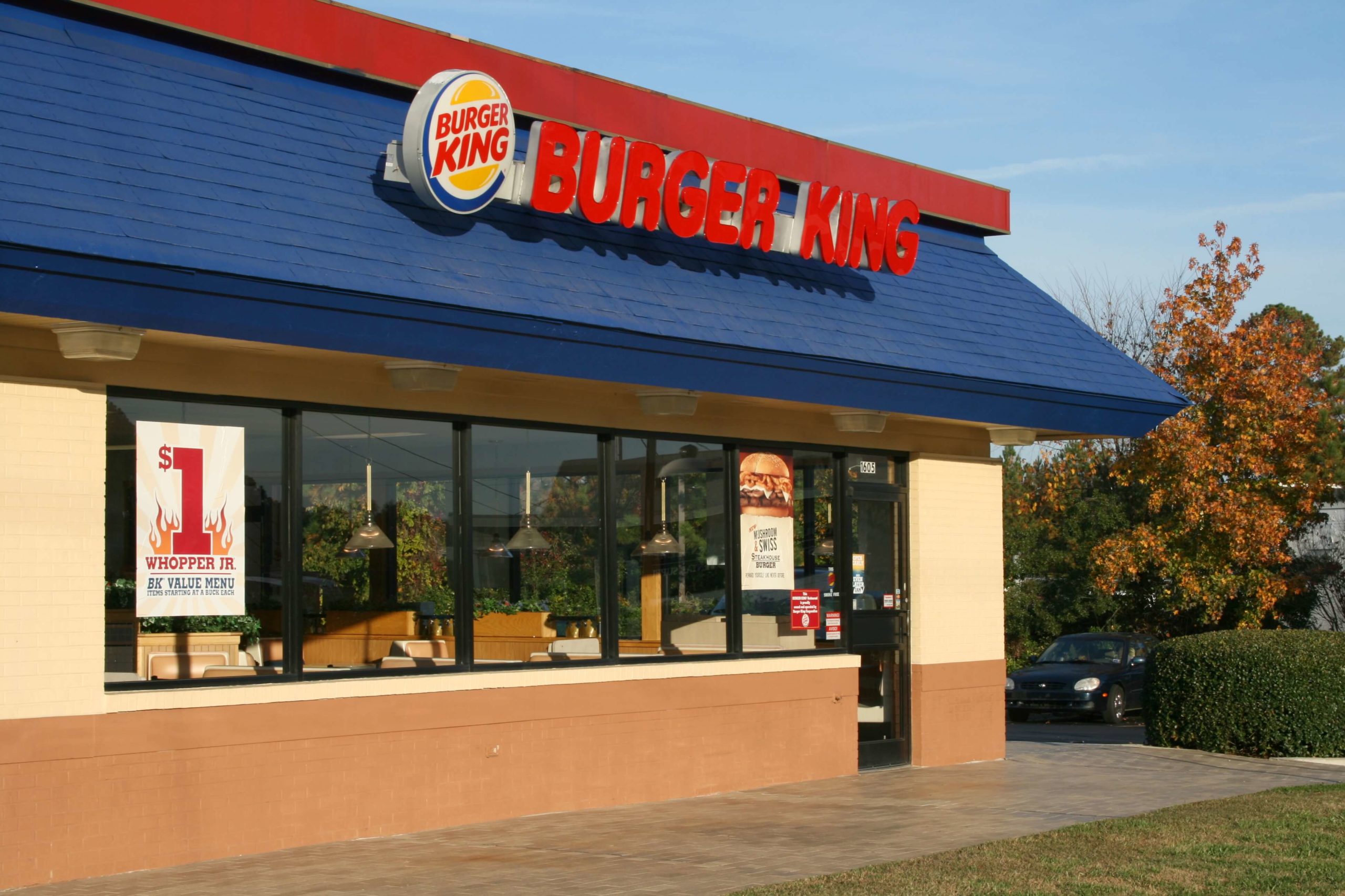
Have you noticed that most fast-food places choose red and yellow for their logos? If you’re curious about the reason, we are here to give you the answer. It’s all about psychology. Rest assured that you’ll never look at McDonald’s and Burger King’s logos the same way again!
The Classic Red and Yellow Logos
This combination of colors is commonly used among many fast-food chains. The most obvious one is McDonald’s, but Pizza Hut also has red and yellow, Subway has yellow, and KFC has opted for red.
Even other places with different main colors have added red and yellow to their logos. Take a look around next time you are in the mall. It’s definitely not a coincidence. Fast-food restaurants pay a lot of attention to their color palettes.
The Psychology Behind It
The thing is, different colors can make us feel different things. Like the warm and cozy feelings we get from the sun, yellow is the color of comfort and happiness. It’s nice and warm, but it’s not over the top. It’s the perfect shade to make you feel good, and fast food chains want you to think of good feelings when you think of them.
The color red, on the other hand, is supposed to make us hungry. Researchers from the University of New Hampshire say that red is often associated with stimulation, appetite, and hunger, and it always attracts attention thanks to how bright and in-your-face it is.
The Perfect Combo
Red makes you hungry, and yellow makes you feel happy, so it’s the perfect combination of colors for a restaurant. That’s why it’s no surprise that fast food places often go for this combo; it will put you in the mood for food!

The colors aren’t the only things they take into account when designing their logo. We all know about logos that look like objects (have you ever looked at the Tostitos logo and seen the two people holding chips over a bowl of salsa?), but next time you’re at McDonald’s, have a look at the arches and tell us they don’t look like fries!